The KEMUCON identity
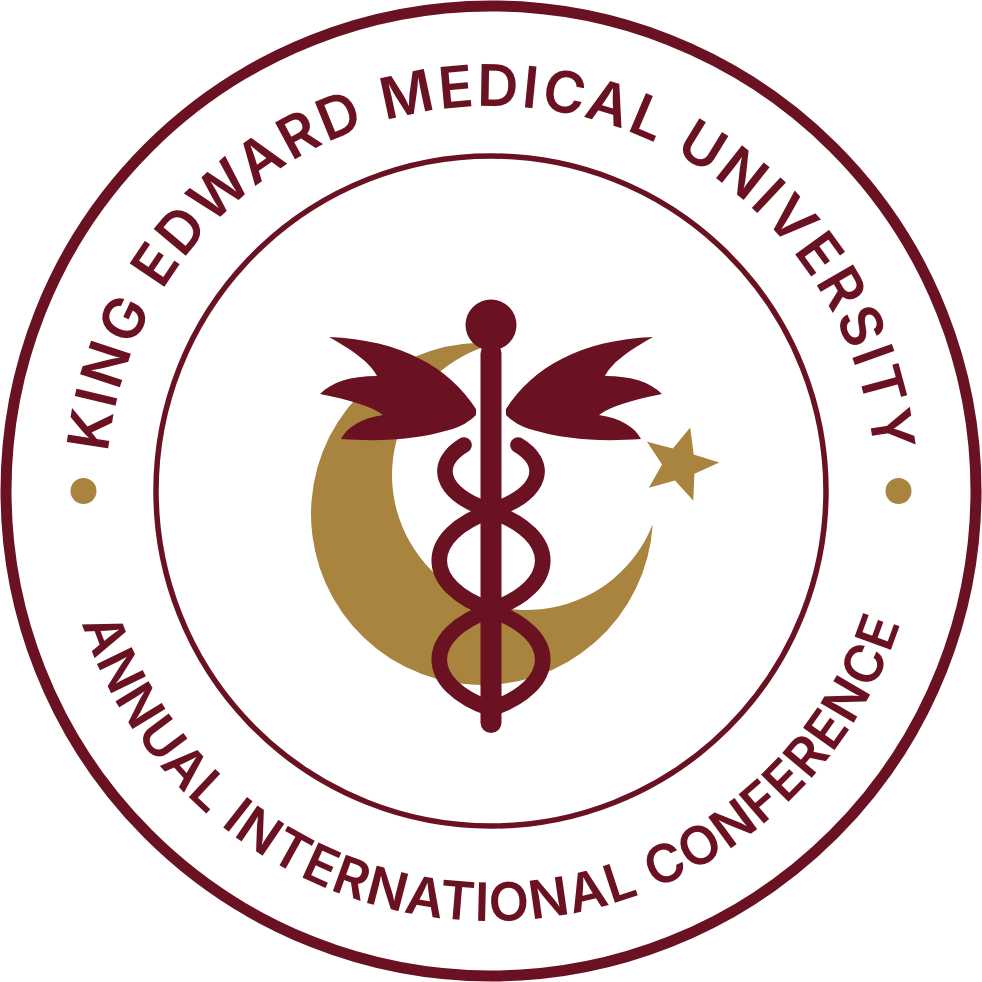
A permanent emblem for the conference, evolved from the seal used for many years: the crescent and star of Pakistan cradling the winged caduceus of the King Edward crest, within a lettered ring.
IEmblem
| Ring | King Edward Medical University above; Annual International Conference below. The lettering always reads upright. |
|---|---|
| Crescent and star | Carried over from the original seal, for the national and international character of the conference. |
| Winged caduceus | Redrawn from the King Edward crest, linking the conference to the university founded in 1860. |
IILogo
Small sizes
Below about 90 pixels, use the compact mark with the plain ring. The lettered ring is not legible at that size.
Clear space
Keep clear space around the logo of at least half the emblem’s diameter.
Edition number
The edition in the wordmark changes each year (“46th KEMUCON”, then “47th KEMUCON”). The emblem and descriptor do not.
IIIColour
Oxblood #6A1222
Primary. Emblem, buttons, emphasis.
Deep oxblood #3A0912
Cover, page headers, footer.
Gold #A9843F
Crescent and star on light backgrounds.
Soft gold #D9BB7E
Emblem and accents on dark backgrounds.
Paper #F7F4EE
Page background.
Ink #161314
Text.
IVTypography
Playfair
Wordmark, headlines and running text. A variable family with optical sizes, by Claus Eggers Sørensen. Open source.
Inter
Ring lettering, labels, navigation and forms. By Rasmus Andersson. Open source.
VDownloads
| Seal, oxblood | For light backgrounds | PNG, transparent |
|---|---|---|
| Seal, gold | For dark backgrounds | PNG, transparent |
| Horizontal logo, oxblood | For light backgrounds | PNG, transparent |
| Horizontal logo, paper | For dark backgrounds | PNG, transparent |
| Compact mark | Favicons, avatars, small sizes | PNG, transparent |